Form Layout Configuration
In order to fit into the look & feel of your website, Visforms comes with very little css of its own. Instead it tries to use the css rules, provided by your template.
This usually works well because templates are now mostly created with so-called UI frameworks, which enable the quick and easy development of attractive and, if necessary, responsive front-end layouts. To do this, you have to provide the correct HTML code structure with the correct UI framework class attributes. Joomla! 3 relies on the Bootstrap UI framework (Bootstrap 2.3.2 for Joomla 3 and Bootstrap 5 for Joomla 4).
Form Layouts
Visforms has a robust "Default Layout" that is UI framework agnostic and looks and works well in conjunction with many templates. However, this layout does not provide any UI Framework specific HTML code. If you use a template that was created with one of the major UI frameworks (Bootstrap or UIkit), then you must set the appropriate UI framework in the form configuration in order to achieve optimal results in the form display.
In addition to its "Default Layout" in the free version for Joomla 3, Visforms provides a layout that generates Bootstrap 2.3.2-compliant HTML code. On Joomla 4, Bootstrap 5 compatible HTML is generated accordingly.
Select UI framework
To do this, go to the "Advanced" tab in the form configuration. Under the "Layout" subheading you will find the "UI Framework" option. The option "None" is preselected, which corresponds to the UI framework-independent "Default Layout".
In the free Visforms version you can alternatively select the UI framework "Bootstrap 2" on Joomla 3. A list box for selecting the "sublayout" then becomes visible. Here you can decide whether the form is rendered:
- Stacked (Default Bootstrap Layout: implements the "default form styles" for Boostrap 2.3.2)
- Horizontal (Horizontal Bootstrap Layout implements Bootstrap 2.3.2 code for "horizontal forms")
- Individual (Multi-column layout: uses the Bootstrap 2.3.2 grid)
If you select the "Individual" option, the form is automatically displayed in two columns. The article "Multi column Bootstrap 2 forms" explains how you can set up an individual multi-column Bootstrap 2 form.
In the free Visforms version you can alternatively select the UI framework "Bootstrap 5" on Joomla 5. This renders a horizontal Bootstrap 5 layout by default.
With the Visforms Subscription you get access to Bootstrap 3, Bootstrap 4, UIkit2 and UIkit 3 layouts for Visforms. These offer optimal results when using visforms on websites with templates based on these UI frameworks. Furthermore, with these layouts you have far-reaching possibilities for the individual configuration of multi-column layouts with all UI-Frameworks, (including Bootstrap 5 on Joomla 4). See documentation for layouts which are compatible with Bootstrap 4 and 5 and for layouts which are compatible with the UIkit 2 and Uikit 3 and if you want to create a multi column form with Bootstrap 3 layout

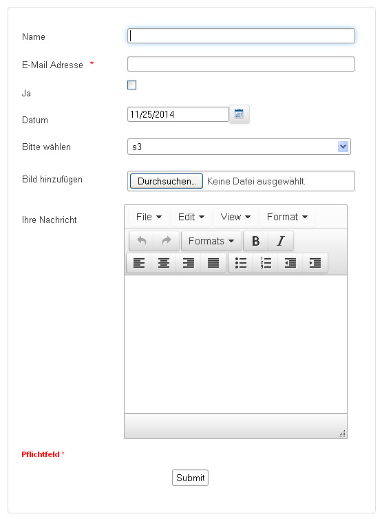
UI-Framework: None
Label and control are aligned in one line, labels are aligned to the left.

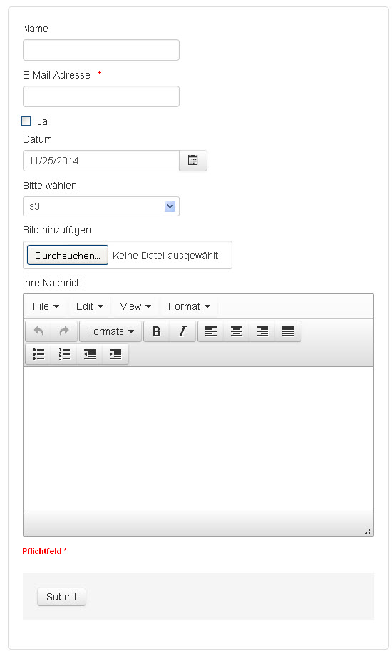
Bootstrap 2 - Stacked
Label is positioned above the control.

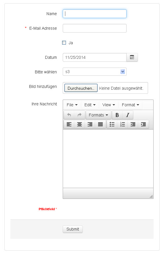
Bootstrap 2 - Horizontal
Label and control are aligned in one line, label is align to the right.
Hide label and use the HTML placeholder attribute
All modern browsers have implemented so called placeholders, which allow you to display a placeholder text inside an input. In contrast to a default value, which will be submitted with the form, a placeholder is just an informative text, that vanishes, either when you click into the input or when you start to enter characters (depending on which browser you use).
You can set a placeholder text in the field configuration, tab "Advanced", This option is only available, for those fields types, that support the HTML placeholder attribute.
Further on you can hide the field label for those fields through configuration. If you have not entered a placeholder text, the field label will be used as placeholder in this case, to make sure, that the user knows what sort of input they are required to enter.
Please note, that the display of a "tool tip text" depends on a field label, because the tool tip is displayed when the user hovers the field label text. When you hide the field label then there is no "tool tip text", too, even if you have entered a "tool tip text" in the field configuration.
The Internet Explorer only supports placeholders since version 10. That is why we have added some Javascript code, that makes sure, placeholders can be used with browsers, that do not support them genuinely, as well.
Mandatory fields and the use of *
It's a common feature to use a * in forms to indicate that a form field is mandatory and the user is required to provide a value.
There are different opinions on whether or not the * should be displayed at all and on where to put it, if it is displayed. Visforms allows you to hide the *. You can find the option in the form configuration's tab "Advanced".
You can add a text Required * to your form, which will only be displayed, if the form actually contains required fields. Use the option "Position of Required tex" in the form configuration tab "Advanced" in order to switch this text of (Don't show) or to select where to show it (above the form fields, below the form fields but above the capthcha (if you have enabled a captcha) or above the form buttons).
InVisforms the * is generated with CSS, which allows you to determine it's position and it's layout much more flexible with your custom CSS.
Position of "Custom Text"
There is a field option in field configuration's tab "Advanced" which enables you to choose the position of the fields "custom text". You can choose between three positions:
- Above the Label
- Above the input
- At the bottom of the input
with the position of the first and second option having a visibly different result only in the Default Bootstrap Layout, because label an input are aligned in one line for the other layouts.
